Safe Passage needed someone to work with their internal media team to improve all aspects of their brand and website. They were getting a lot of publicity for their incredible cause so they needed an effective platform that could drive donations and demonstrate their live-saving work.


The brand line uses Safe Passage’s colours to illustrate the different and varied challenges and terrain the children can cross to reach safety. The reality is, many children have died trying to reach safety. Safe Passage are a fundamental part of providing legal and safe routes to sanctuary.
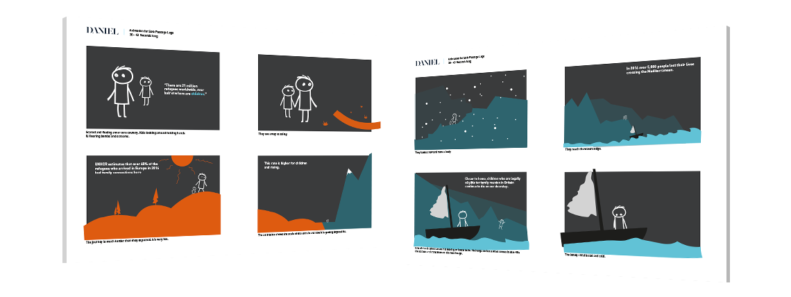
Safe Passage needed a device that could quickly tell their story, what they do and how they help children around the world. A simple and engaging animation was the best solution to deliver this and work online in an effective way.
We produced a set of storyboards to give the animation a structure and graphic style. Storyboards are essential for animators as it gives them a clear script, style and tone to follow.
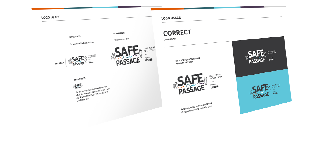
THE BRAND PALLET
WAS CHOSEN TO REFLECT
ALL THE EMOTIONS
OF THE CHARITY
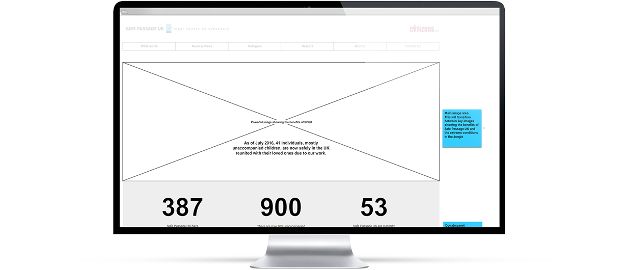
Safe Passage has a diverse mix of target users, which all needed to have a space and feel like the website has been designed with them in mind. Simple but effective navigation and crossing-pollination of content helps users freely navigate the website but return or find new sections with ease. In particular, there needed to be clear and constant links to the donation section. Getting this wrong could change the level of donations by tens of thousands each year.
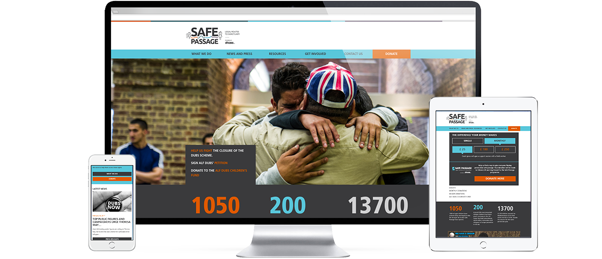
The design needed to be clear and allow the content to be as legible as it is engaging. The colour pallet was split out and used to focus on particular user journeys. Orange was chosen for donations as it has an energy and high contrast against the other colours in the pallet.
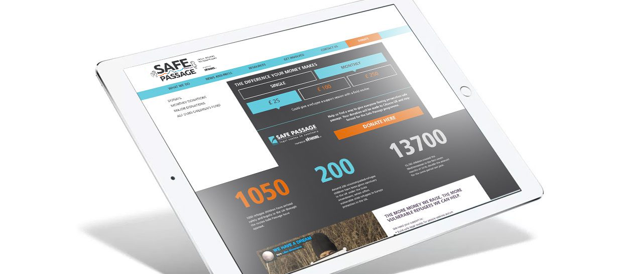
All of our websites are designed to be fully responsive for all user interfaces. Responsive means your website will adapt and display accurately and as it should on all devices from mobile to desktop. For Safe Passage, we needed to make sure the user journey for mobile and tablet donations was as easy as desktop.

Every year the Guardian and Observer choose which charities they want to support and promote. Any charity that is chosen gets priceless exposure and all donations are shared out between the chosen charities. In 2016 the Guardian and Observer charity appeal raised almost £1.6M, £533,000 went to Safe Passage.
“I can’t describe how I felt when I first saw my brother again, after two years. At that moment I felt hugely thankful to Safe Passage and everyone who had helped me.” Adnan was just 14 when, after a perilous journey from Syria followed by a traumatic five months in the squalor of the migrant camp in Calais, he was reunited with his brother – his only surviving relative – in the UK.
| Cookie | Duration | Description |
|---|---|---|
| cookielawinfo-checkbox-analytics | 11 months | This cookie is set by GDPR Cookie Consent plugin. The cookie is used to store the user consent for the cookies in the category "Analytics". |
| cookielawinfo-checkbox-functional | 11 months | The cookie is set by GDPR cookie consent to record the user consent for the cookies in the category "Functional". |
| cookielawinfo-checkbox-necessary | 11 months | This cookie is set by GDPR Cookie Consent plugin. The cookies is used to store the user consent for the cookies in the category "Necessary". |
| cookielawinfo-checkbox-others | 11 months | This cookie is set by GDPR Cookie Consent plugin. The cookie is used to store the user consent for the cookies in the category "Other. |
| cookielawinfo-checkbox-performance | 11 months | This cookie is set by GDPR Cookie Consent plugin. The cookie is used to store the user consent for the cookies in the category "Performance". |
| viewed_cookie_policy | 11 months | The cookie is set by the GDPR Cookie Consent plugin and is used to store whether or not user has consented to the use of cookies. It does not store any personal data. |